
Small Spaces Can Handle Big Color

I used to think small spaces needed to stay light and neutral, like they were shy or something. But then I found out about color drenching, and everything changed. If you haven’t heard of it, color drenching is when you use one bold color across the walls, trim, and even the ceiling. It sounds intense, right? It is. In the best possible way.
So naturally, I went all in and painted our bathroom Salute by Sherwin Williams.


This space went from basic to bold faster than I could light a taper candle. I leaned into the drama with warm, moody walls in Salute by Sherwin Williams, wrapping the whole room in this deep, saturated red. It completely transformed the space into a little jewel box, that is rich, layered, and full of personality. It’s amazing what the right color can do in a small room.
Let’s talk about the details, because they really make the room. The gold mirror and vintage-style light fixture set the tone right away, but it’s the smaller touches that really bring it home. The curved brass faucet, the toilet lever, and the matching towel hook all tie into the warm, moody palette. The candles add that soft, cozy glow, and the shower curtain adds just enough drama. It’s giving "tiny royal retreat" in the best way.


Here’s something to keep in mind if you’re thinking about trying a bold color yourself: lighting makes a big difference. The same paint color can look completely different depending on the natural and artificial light in your space. Since this bathroom doesn’t get a ton of natural light, I leaned into the warmth and picked a rich red that glows under the sconces and candlelight. If your room gets a lot of sun, a deep navy or forest green might give you that same cozy effect without feeling too heavy. Cool light will bring out cooler tones, and warm bulbs will make everything feel a little more golden and soft.


People always say small rooms need light colors to feel bigger, but I think they just need confidence. This bathroom proves that going bold in a small space doesn't make it feel smaller. It makes it feel intentional. It makes it feel designed.
So if you’ve been tempted to try something dramatic, especially in a space that’s a little smaller, this is your sign. Go for the deep green, the inky blue, the moody plum. Or, if you’re really ready to have fun, go full red.
You just might fall in love with your house all over again.
Links at a Glance
Black Round Mirror (Before Picture)
Ruffled Shower Curtain (Before Picture)
Vintage-Inspired Light Fixture
Brass Plate - Antique Store Find
Gold Frame - Antique Store Find
IF YOU ENJOYED THIS POST, YOU MIGHT BE INTERESTED my Blog post about The Paint Colors in my house!

FAQ: Color Drenching Doorways
How to Color Drench Your Doorways Like a Pro!
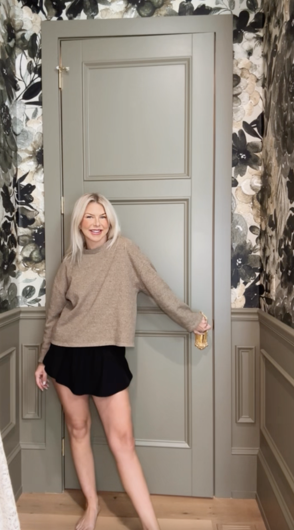
One of the biggest questions I get when it comes to color drenching is: What do you do with the door?! If you’ve been wondering the same thing, don’t worry—I’ve got you covered! Let’s break it down step by step so you can achieve that seamless, stylish look in your space.
Step 1: When the Door is Shut…
When your door is completely closed, it should match the walls in that room. That means if you’re drenching your space in a dreamy shade of green, your closed door should blend right in with that same color. Easy, right?
Step 2: When the Door Swings Open…
Here’s where it gets a little more dynamic! When you open the door, the front side (the side that faces into the next room) should match that room’s color. So if you’re stepping into a green-painted space, the front side of the door that faces that room should be green.
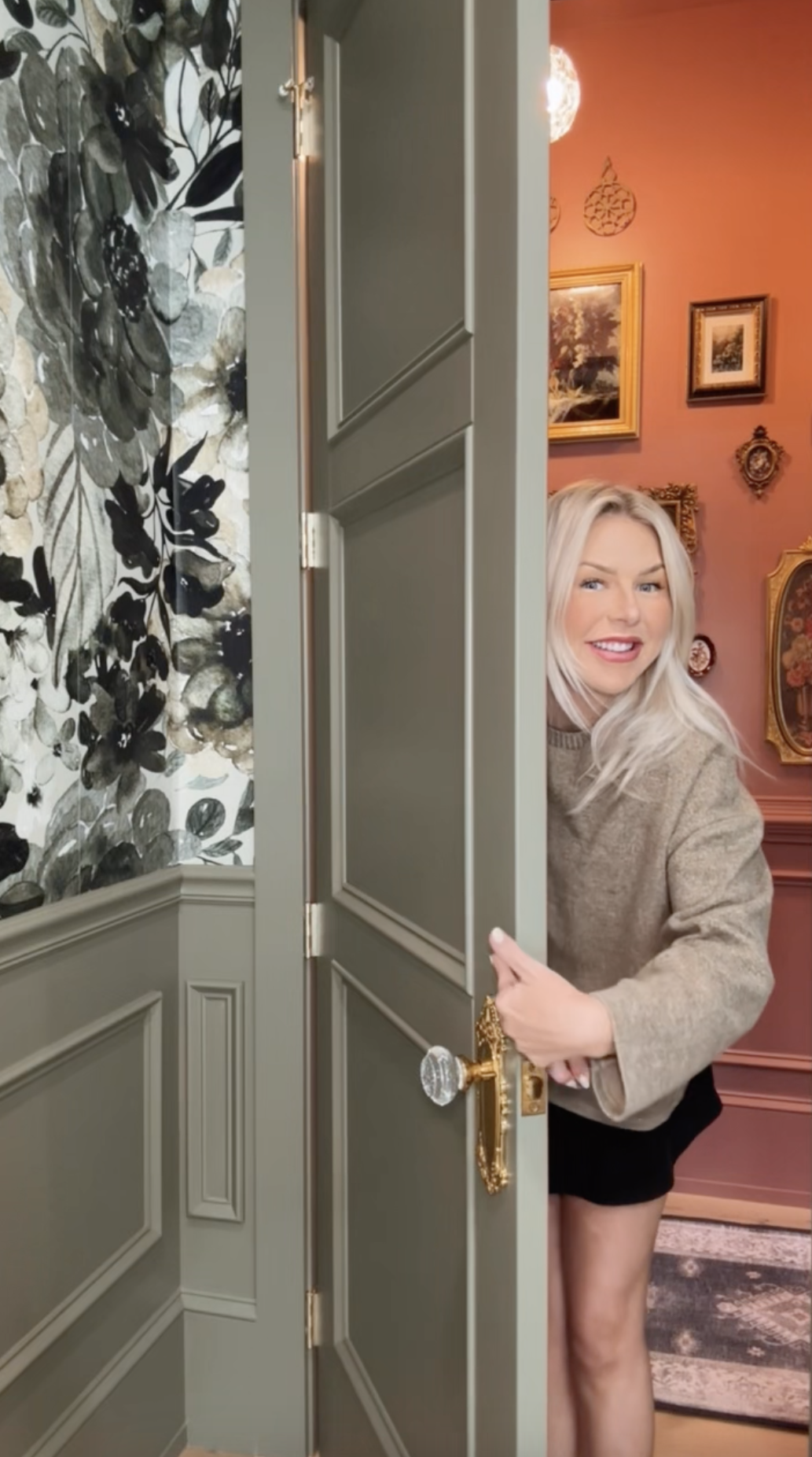
Step 3: What About the Backside of the Door?
Now, go to the backside of the door and check the hinges. This side of the door should match the room you are standing in when the door is open. So, if you’re standing in a pink room, that side of the door should be pink.


Step 4: The Door Jamb—Let’s Walk Through It Together!
Now, let’s talk about the door jamb (the frame around your door).
Stand on the side where you pull the door shut. Every part of the jamb that you see from this angle should match the door. So if your door is pink, the visible jamb here should also be pink.
Now move to the other side, where you push the door shut. The rest of the jamb on this side should match the walls of that room. Imagine your door “nestled” into its frame—it should all be a smooth continuation of color.


The Key to a Seamless Look
The main goal here is to avoid seeing another color peeking through when your door is closed. Keeping the door and its surrounding frame within the same color family ensures a cohesive, wrapped-in-color effect that truly embodies the color-drenched aesthetic.
Now, It’s Your Turn!
I promise—it’s just paint! You can always tweak and adjust as you go. So go ahead, grab that paintbrush, and transform your space with the magic of color drenching. You got this!
Happy painting!
Shop This Post
Interested in my paint colors? Click here!
Interested in my wallpaper? Click here!
Found something you like? Shop these rooms here!
IF YOU ENJOYED THIS POST, YOU MIGHT BE INTERESTED IN MY HOW TO Make a Floor Plan: To Scale POST.
FOLLOW ME ON MY SOCIALS!

Color Drenching
Transform Your Space with Color Drenching
If you love bold, statement-making interiors, color drenching might just be your new favorite design trick! This trend is all about embracing a single hue and using it across walls, ceilings, trim, and even furniture for a rich, immersive effect. Whether you want to create a cozy, moody vibe or a bright, energetic space, color drenching is an easy way to make a big impact. Let’s dive in!


Moody Elegance: Color Drenching in the Primary Bedroom
This stunning room is a perfect example of the power of color drenching. Painted in Field Trip by Clare, the deep olive green envelops the walls, ceiling, trim, and even doors in an ultra-cohesive and immersive atmosphere. The single-hue approach enhances the room’s architectural details, making the intricate molding and paneling stand out in a sophisticated way. The eggshell sheen adds a subtle warmth and soft texture that elevates the space.
This space proves that color drenching isn’t just about painting everything the same shade—it’s about layering textures, finishes, and complementary tones to create a truly stunning effect!
If there's something in this room that catches your eye and you'd like the link, just click here!


A Bold and Inviting Hallway with Color Drenching
Hallways are often overlooked in design, but this space shows how a rich, saturated color can elevate even the most transitional areas into something special. Painted in Reddened Earth by HGTV Home by Sherwin-Williams, the warm, earthy tone envelops the walls, trim, and ceiling in a cozy yet dramatic embrace. This terracotta-inspired hue adds depth and warmth, creating a welcoming atmosphere as you move through the space.
Color drenching here brings out the architectural details, allowing the moldings and doorways to flow seamlessly into the design, avoiding any interruptions to the visual flow. The warm undertones complement the natural wood elements and soft lighting, enhancing the intimacy and stylish vibe of the space. The walls and ceiling are finished in satin sheen, while the doors have a semi-gloss finish. If I had to do it again, I would opt for satin on the doors as well—the semi-gloss feels a bit too glossy for my taste.
This hallway proves that even the smallest spaces can make a big impact with the right color and finish choices!
If there's something in this room that catches your eye and you'd like the link, just click here!


Soft & Serene: A Dreamy Bedroom with 50% Malted Milk
For a cozy yet elevated feel, this 50% Malted Milk by Sherwin-Williams color-drenched bedroom is the perfect balance of warmth and softness. By using a lighter, custom-mixed version of this creamy beige, the space feels airy and inviting while still offering a rich, enveloping effect. The walls, ceiling, and trim all blend seamlessly, creating a soothing and cohesive environment—perfect for a restful retreat.
The eggshell sheen adds just the right amount of softness while reflecting a touch of light, keeping the space feeling warm and welcoming. Looking back, I would opt for 100% Malted Milk instead for a bit more depth and richness, but this toned-down version still creates a beautiful and serene atmosphere.
Color drenching in this subtle, warm tone proves that neutrals can be just as impactful as bold colors, bringing depth and character while maintaining a timeless, calming aesthetic.
If there's something in this room that catches your eye and you'd like the link, just click here!


Fiery & Bold: A Red Bathroom
For a bathroom with impact, Salute by Sherwin-Williams is the perfect deep red hue. Its rich, warm tone envelops the space, creating a bold yet inviting atmosphere. Paired with crisp white trim, the contrast highlights the red's intensity without feeling overwhelming.
The eggshell sheen offers a soft luster, reflecting light while maintaining the color's depth and drama. This striking shade pairs beautifully with gold hardware and dark wood, creating a dynamic yet cozy retreat. Salute proves that bold colors can add warmth and character, transforming a bathroom into a memorable space.
If there's something in this room that catches your eye and you'd like the link, just click here!


Bright & Airy: A Sunroom Drenched in Light
For a sunroom that celebrates natural light, Maison Blanche by HGTV Home by Sherwin-Williams is the perfect soft, creamy white. The hue captures the sunlight streaming through the windows, enhancing the space with a fresh, open feel. Color drenching the walls, ceiling, and trim creates a seamless, airy environment that feels expansive and peaceful.
The satin sheen adds a subtle glow, reflecting light while maintaining a smooth, sophisticated finish. The warm undertones of Maison Blanche complement the abundance of natural light, making the room feel both bright and inviting. This soft white pairs effortlessly with light wood furniture and vibrant greenery, transforming the sunroom into a serene retreat that feels connected to the outdoors.
If there's something in this room that catches your eye and you'd like the link, just click here!


A Playroom Full of Color & Fun
For a lively and cheerful playroom, Pressed Flower by Sherwin-Williams brings the perfect pop of color. This soft, yet vibrant hue adds warmth and energy to the space, creating an environment where creativity can flourish. Drenching the walls in this joyful tone envelops the room in a welcoming, playful atmosphere.
The flat finish provides a smooth, understated look, but I recommend opting for eggshell for a bit more durability and a subtle sheen that’s easier to clean. Pressed Flower pairs beautifully with colorful toys, playful patterns, and cozy textures, making it a space where fun and imagination can run wild. It’s the perfect backdrop for a room that will grow with your child, offering both whimsy and warmth.
If there's something in this room that catches your eye and you'd like the link, just click here!

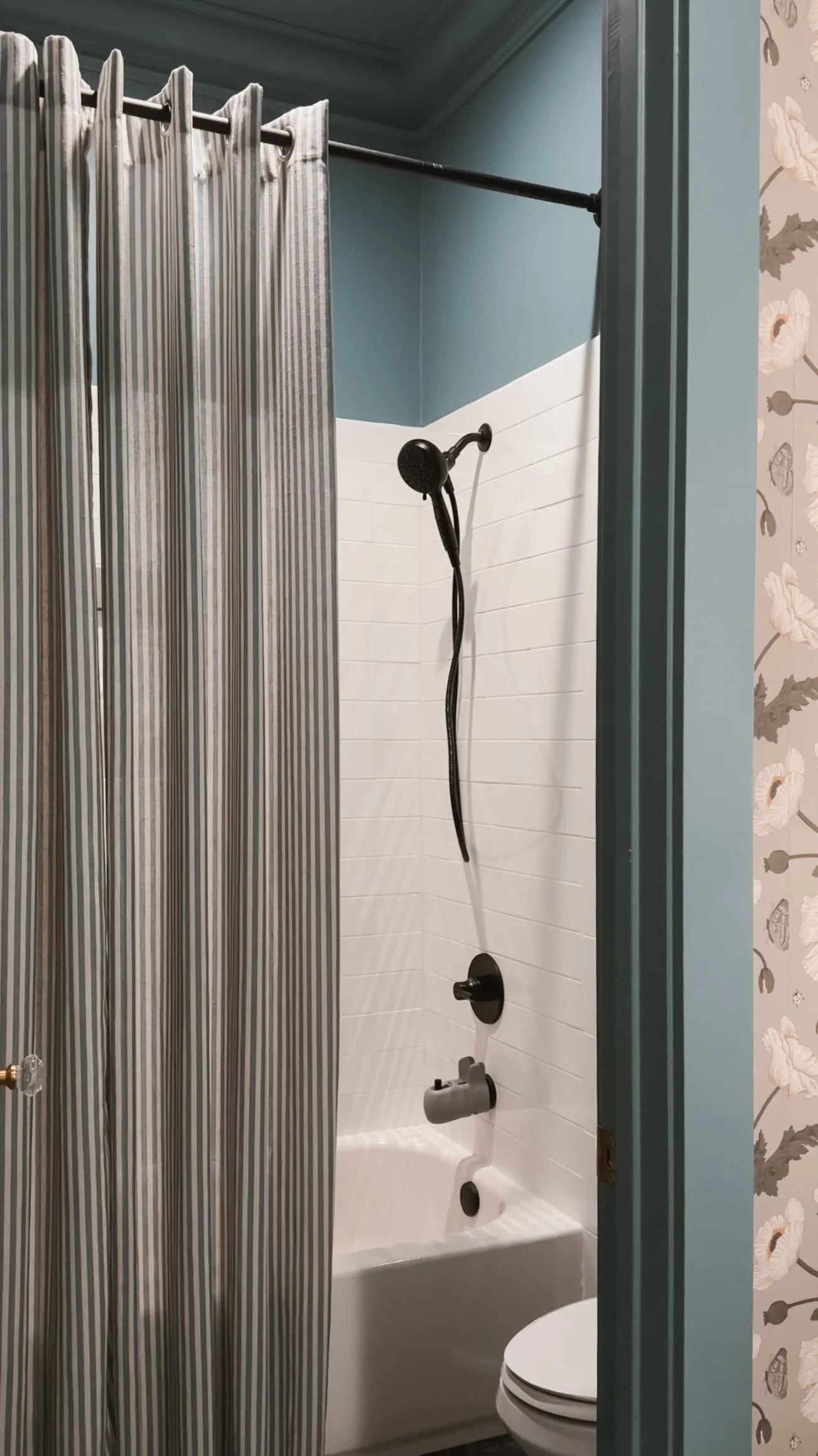
A Tranquil Blue Bathroom Retreat
Norwegian Blue by Behr brings a calming, cool tone to this beautifully color-drenched bathroom. The front room, with its sinks, features a floral wallpaper that adds texture and depth, while the back room—containing the toilet and shower—embraces the full power of this rich blue, creating a serene and cohesive feel throughout.
The eggshell sheen offers a soft, reflective glow that enhances the depth of Norwegian Blue, providing just the right amount of light without being too shiny. The color works harmoniously with the bathroom's fixtures and textures, making the space feel both fresh and tranquil. Whether you’re washing up or relaxing, this blue bathroom offers a peaceful retreat that feels timeless and inviting.
If there's something in this room that catches your eye and you'd like the link, just click here!


Warm & Inviting: A Guest Room with Rich Comfort
Nut Brown by Behr creates a cozy and welcoming atmosphere in the guest room, wrapping the space in a rich, earthy hue. Color drenching the walls in this deep brown gives the room a grounded, intimate feel, perfect for guests to relax and unwind.
The eggshell sheen adds a soft, subtle glow that highlights the depth of Nut Brown without overpowering the space. This warm, inviting color pairs beautifully with plush bedding, soft lighting, and natural wood accents, creating a serene environment that makes every guest feel at home. The timeless richness of Nut Brown ensures the room remains stylish and comfortable, offering a restful retreat for anyone who stays.
If there's something in this room that catches your eye and you'd like the link, just click here!
IF YOU ENJOYED THIS POST, YOU MIGHT BE INTERESTED IN MY playroom makeover.
FOLLOW ME ON MY SOCIALS!

Primary Bedroom

When we first moved into our home, our primary bedroom was as plain as could be—white walls, no character, nothing special. I knew I wanted to transform it into a moody, vintage-inspired retreat, so I went all in, and let me tell you—it was worth it!


The first thing I did was add wall panel moulding and crown moulding to give the space that classic, architectural feel. To take it up another notch, I installed a fireplace and a ceiling medallion, both of which instantly added charm and history to the room. Then came the paint—color drenching the entire space in a deep, rich green called Field Trip by Clare Paint. I used a paint sprayer to get the job done after installing the moulding because painting all those details by hand would have taken forever. If you’re considering a project like this, I highly recommend a sprayer to save time and get a flawless finish.
For furniture, I mixed vintage and modern pieces to create a layered look. My nightstands are from TJ Maxx, and the vintage bedside table lamps and stunning chandelier are both from an antique store called Queen of Hearts. The arched canopy bed brings a modern touch, while the solid brass door knobs, switch plate covers, and hinges add a timeless elegance. The white rug helps balance out all the dark tones and keeps the space from feeling too heavy.
To bring in texture, I added bird-patterned curtains that feel playful yet sophisticated. The mirror in the room is grand, gold, and absolutely stunning—one of my favorite pieces. For art, I incorporated a black and white print from BigWallDecor, along with a vintage piece I found at an estate sale next door when we first moved in. I also brought in a live-edge console table from World Market to add a bit of organic warmth. To finish the space, I added two rust-colored swivel chairs, which not only make the room feel cozy but also bring in another modern touch.


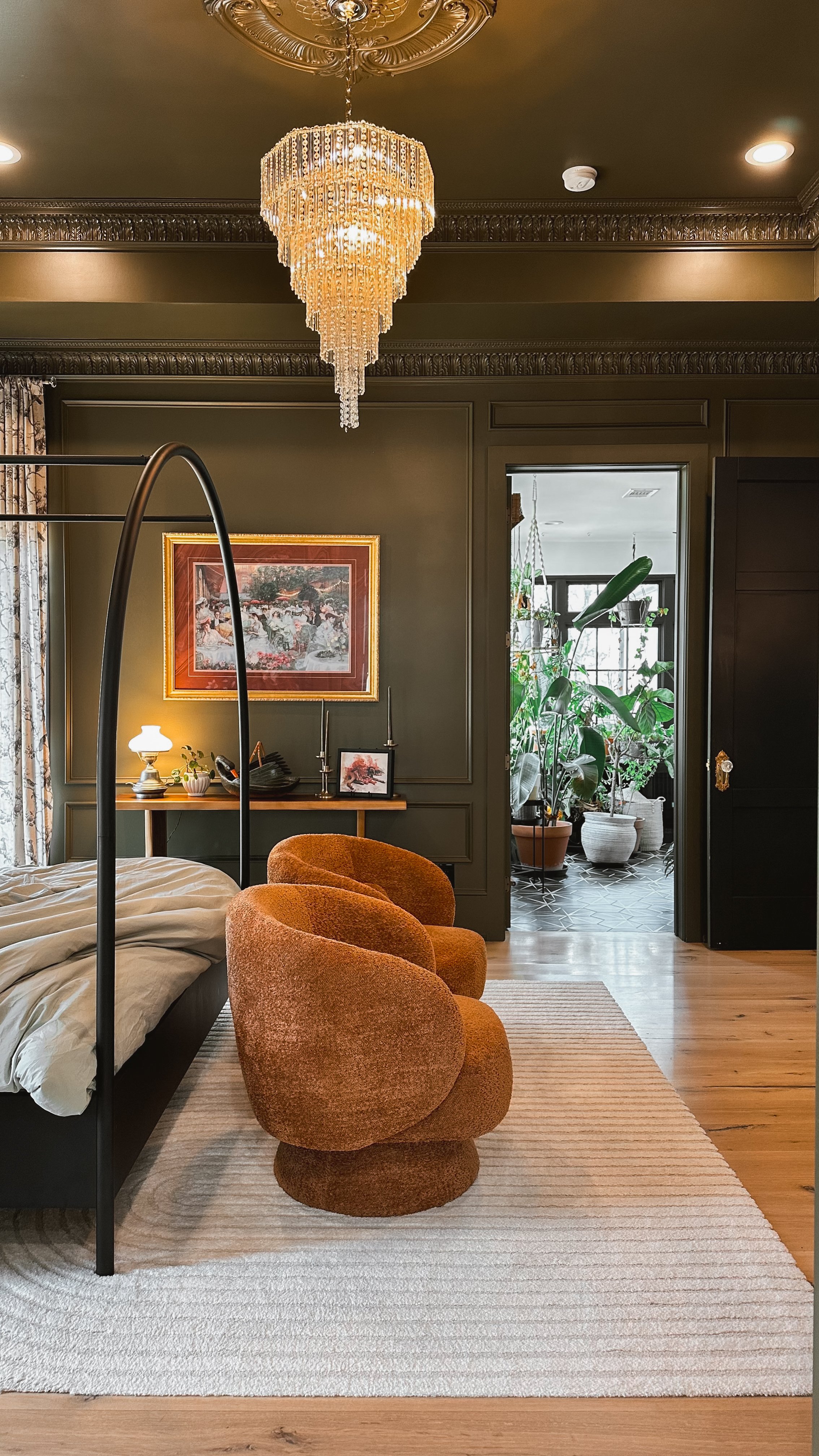


This room has truly become my favorite space in the house. It’s the one that defined my home decor style—moody, vintage, and a little bit modern. Every time I walk in, I feel like I’m stepping into a space that tells a story, and I wouldn’t change a thing.
Links at a glance
Nightstands: TJ Maxx
Gold Framed Art: Antique Store
Chandelier: Queen of Hearts Antiques & Interiors
TV Frame: DIY Project (similar option here!, use code LUTZGOHOME to save $)
White Column Pedestal Stand: Antique Store
Large White Vase: At Home
Gold Planter: Estate Sale